

How might we make travel less a hassle by alleviating motion sickness?
As air travel gets more popular, it is still uncomfortable for a lot of people, and motion sickness is more than discomfort. It shapes how people plan, endure, and recover from flights.
In 4–5 weeks, our team went from an open brief to a working product that learns your body's response and personalizes relief, where I led the user research and created design system for digital app.
My role
User Researcher
Product Designer
Design Team
2 Industrial Designers
2 Graphic Designers
1 UX Researcher
Skills
Desk research
User testing
Empathy mapping
User journey mapping
Rapid prototyping
Timeline
Nov – Dec 2025
Part 1. Research
Define the question in ambiguity
Our brief was open-ended: our team decided to explore travel space, because it is fun. Through early research, I interviewed 3 participants about their travel pain points and learned that during flight is the stage that stresses people the most when things are out of their control, especially when traveling with groups or pets and when experiencing motion sickness.
By using an empathy map, archetype, and user journey, we mapped where friction was highest and where existing products fell short, we created the Turbulent Passenger and the Burdened Traveler.
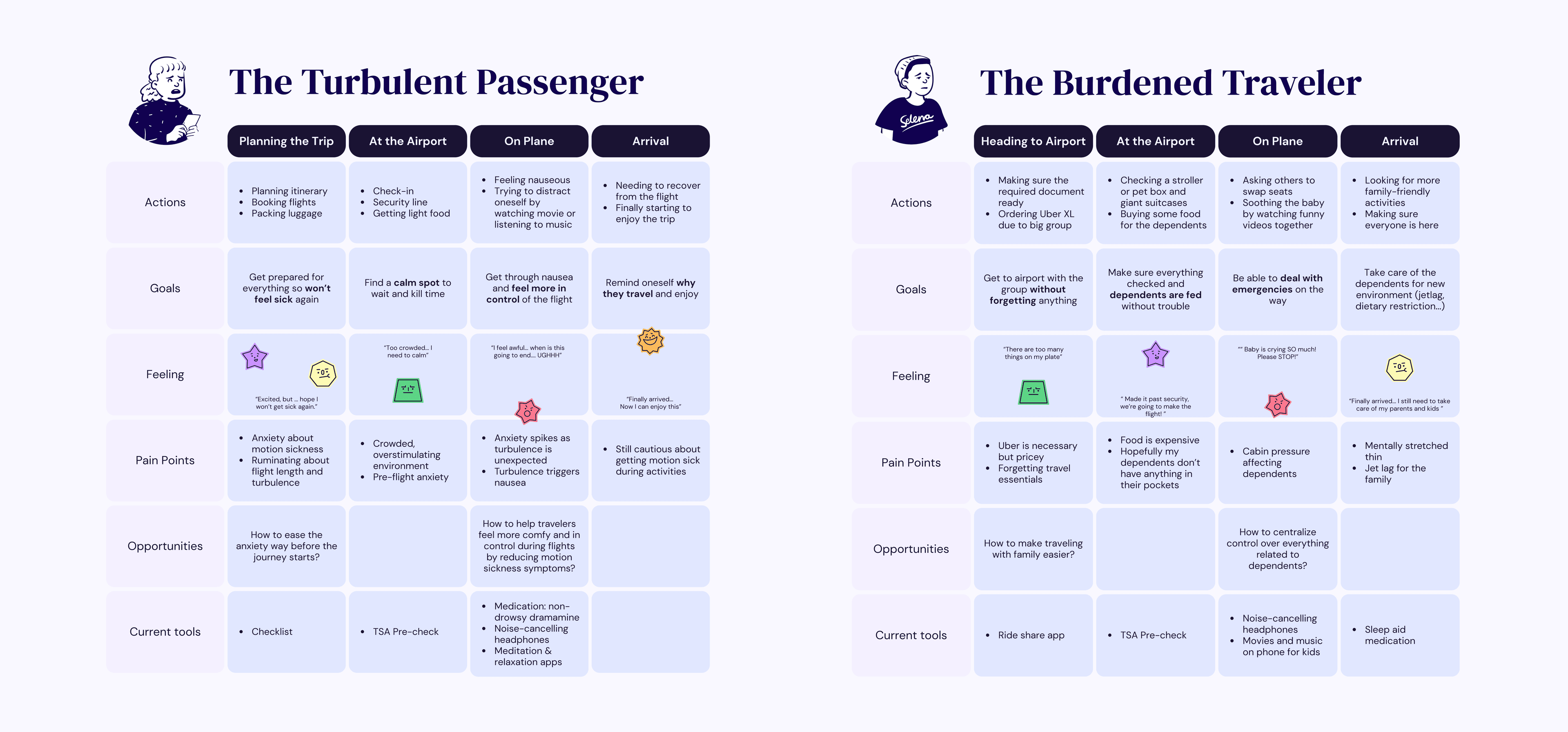
Digging into the Burdened Traveler's journey, I pointed out that most of their pain points come from the people they're responsible for, not from themselves. Elderly parents, kids, pets. That means solving for them means designing for highly varied, hard-to-generalize needs.
Desk research (opens in a new tab) also suggested that roughly 1 in 3 people experience motion sickness. Current solutions, like ear planes (opens in a new tab) and meditation apps exist, but they are passive and disconnected from each other.
Further secondary research gave us a technical foothold: a 2025 study by Gu et al. (opens in a new tab) found that just 1 minute of exposure to a 100Hz tone may significantly reduce motion sickness symptoms. That immediately shaped our design direction.
How might we make air travelers feel calm and in control throughout their flight by minimizing motion sickness and turbulence-related anxiety?
Part 2. Ideation
Design in the age of AI
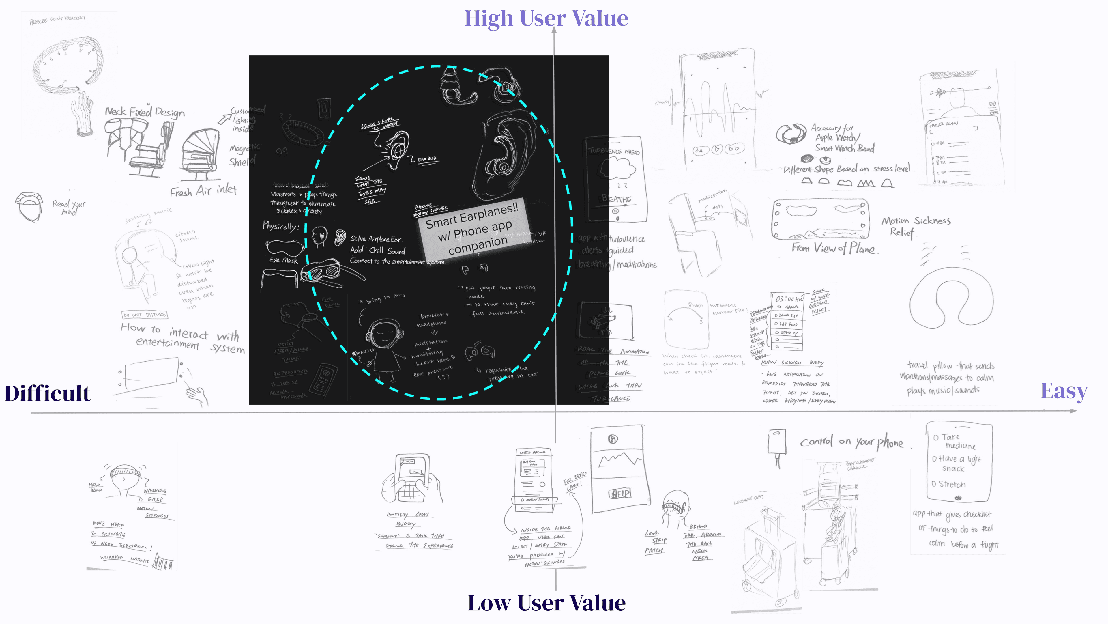
We mapped our ideas on a 2 by 2 matrix to help us down-select. There are some easy-to-implement and high-impact ideas, like visualizing turbulence on a phone screen, and travel pillows that play soothing music or send calming messages. Notably, all five team members converged on the same idea: smart earphones paired with a companion app.
We leveraged the AI tool, Figma Make, to rapidly generate two versions of the app UI from wireframes and screen specs, then condensed the good design from them into one and tested it with users in a non-airplane environment.
Then I led validation testing with real market products and suggested 100Hz frequency sound with participants who were actively traveling during Thanksgiving break, which was a great opportunity to run testing without budget.
Surprisingly, participants mentioned 100Hz sound sometimes resonated with the airplane engine negatively, and 80% of the participants suggested higher frequencies produced better outcomes.
Part 3. Testing
Understand the nuance in the human
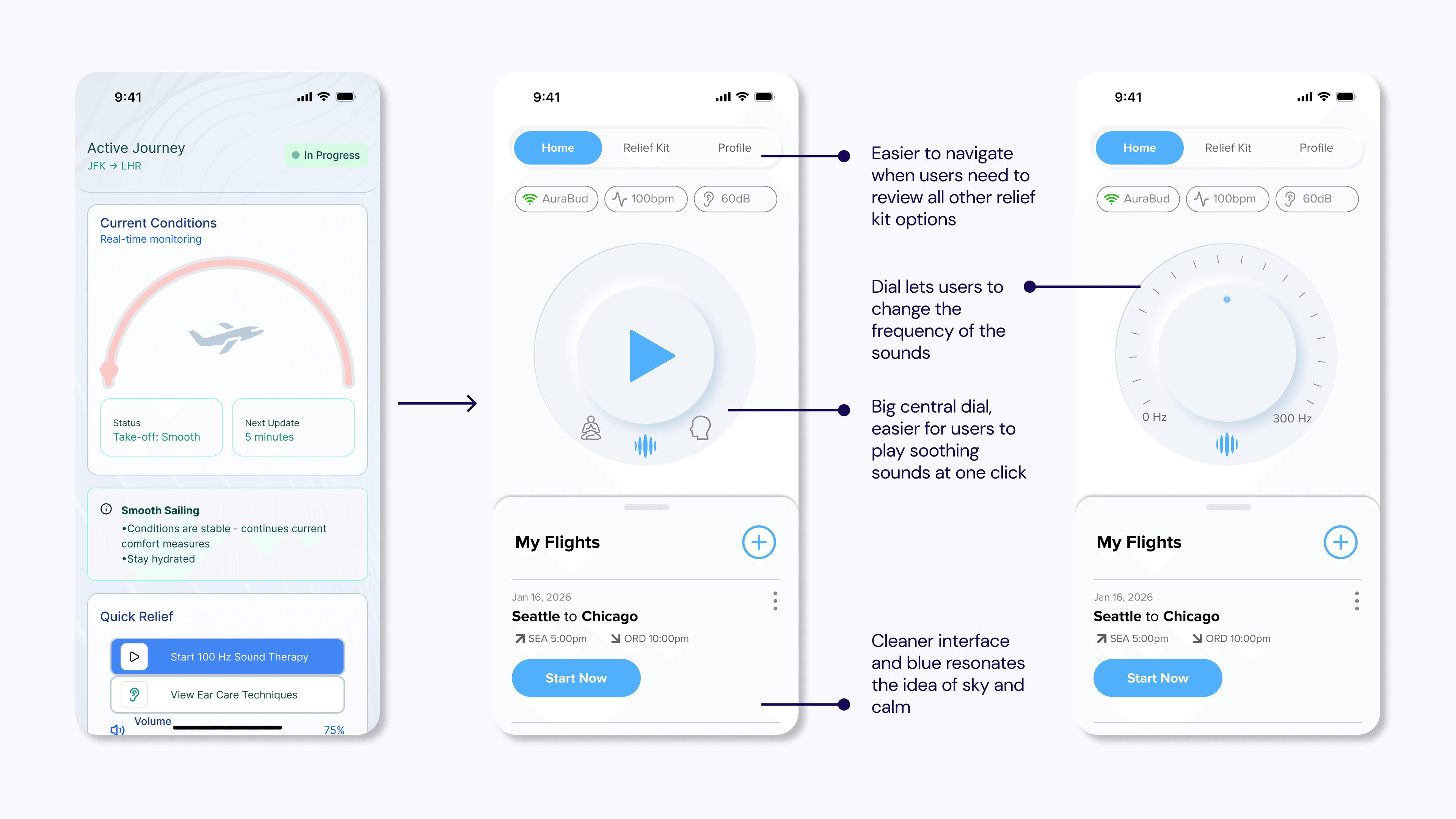
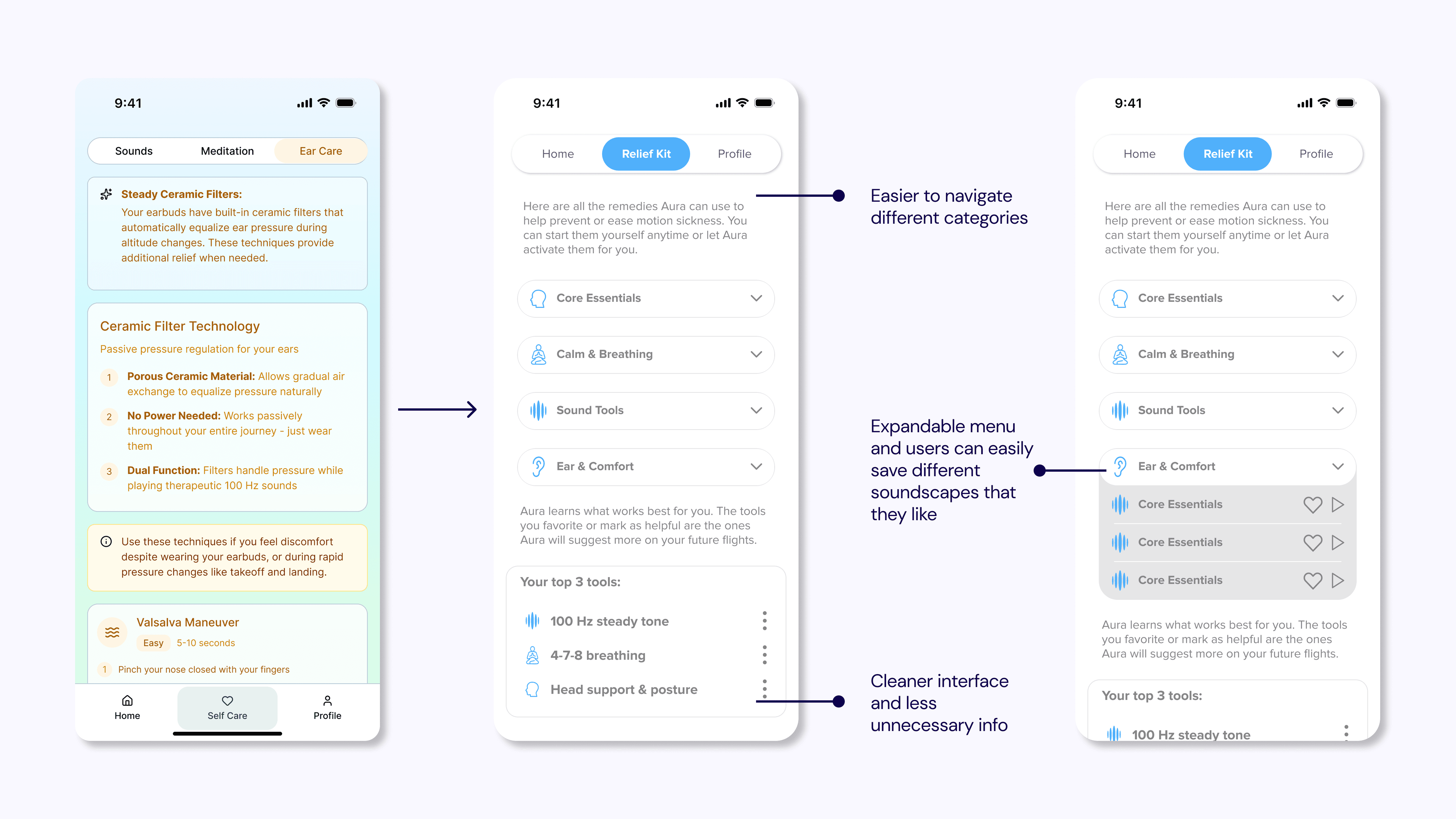
Based on the user feedback, we redesigned product branding, as well as the digital product. The goal is to make the app distinctive, personal, and easy to navigate under discomfort.
I redesigned the design system and used Figma Make again to rapid prototype within a week before the final presentation.
Part 4. Design Product
Focusing on the goal and designing around real constraints
Rethinking the goal, we wanted to provide relief to passengers and make them feel more in control, something that most people that we talked to struggled the most, especially if they experience motion sickness. The revised design was cleaner, more branded, and better suited to someone who might already be feeling unwell.
Here’s a user journey video I edited, where we created a user profile Daisy, who experiences severe motion sickness but has to travel frequently. All the images and videos were generated by using Gemini Nano Banana and Veo 3.1 respectively.
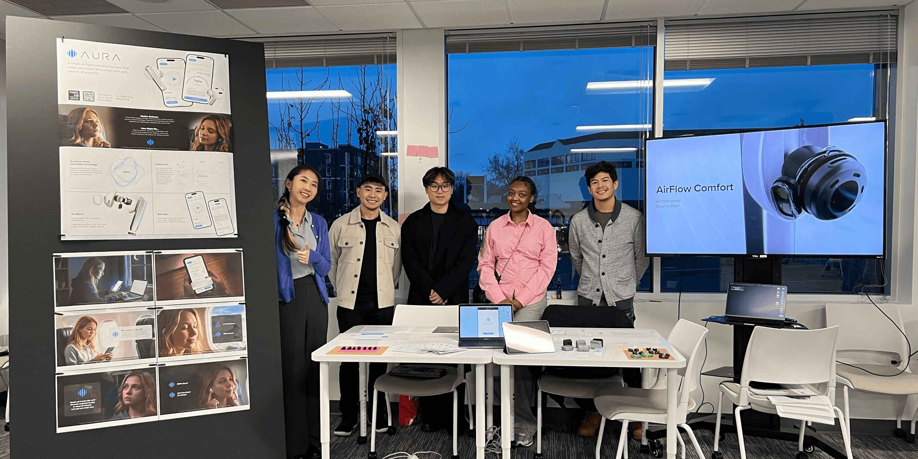
We presented AuraBuds and the Aura app with the physical product in hand at the end-of-quarter showcase to program alumni, faculty, and industry professionals. The showcase gave us the chance to put the product in front of people with real domain expertise and collect reactions beyond the controlled testing environment.
Next Step
The personalization model is promising but hasn't been tested in real flight conditions with real sensor data. The next step would be to enhance the real functions of physical product and instrument a field study, getting the physical product on actual travelers and validating whether the adaptive remedy recommendations hold up outside the lab.
What I learned
This project put two kinds of constraints in play. The first was time: four weeks is not enough to run research the way a textbook would prescribe, and I had to get comfortable with that quickly. I let the order of things break down when it needed to, and I found that working in that gap was its own skill.
The second constraint was limited design space. Our group decided to design for an in-flight experience, which narrowed the design space significantly, but I think it pushed us toward more creative decisions than an open brief would have. For example, we used AI tools to save time for more important aspects of the project.
Taken together, both constraints taught me to use methods and tools more flexibly. Not cutting corners, but being deliberate about what actually deserved time.